UNCANNY 2023
For my FMP (final major project), I created the idea for a horror movie festival based in the north-east, titled UNCANNY 2023. Alongside coming up with the idea for the festival, I also designed the advertising and branding for the event, illustrating and designing aspects such as the advertising poster, horror movie posters, editorial and social media adverts.


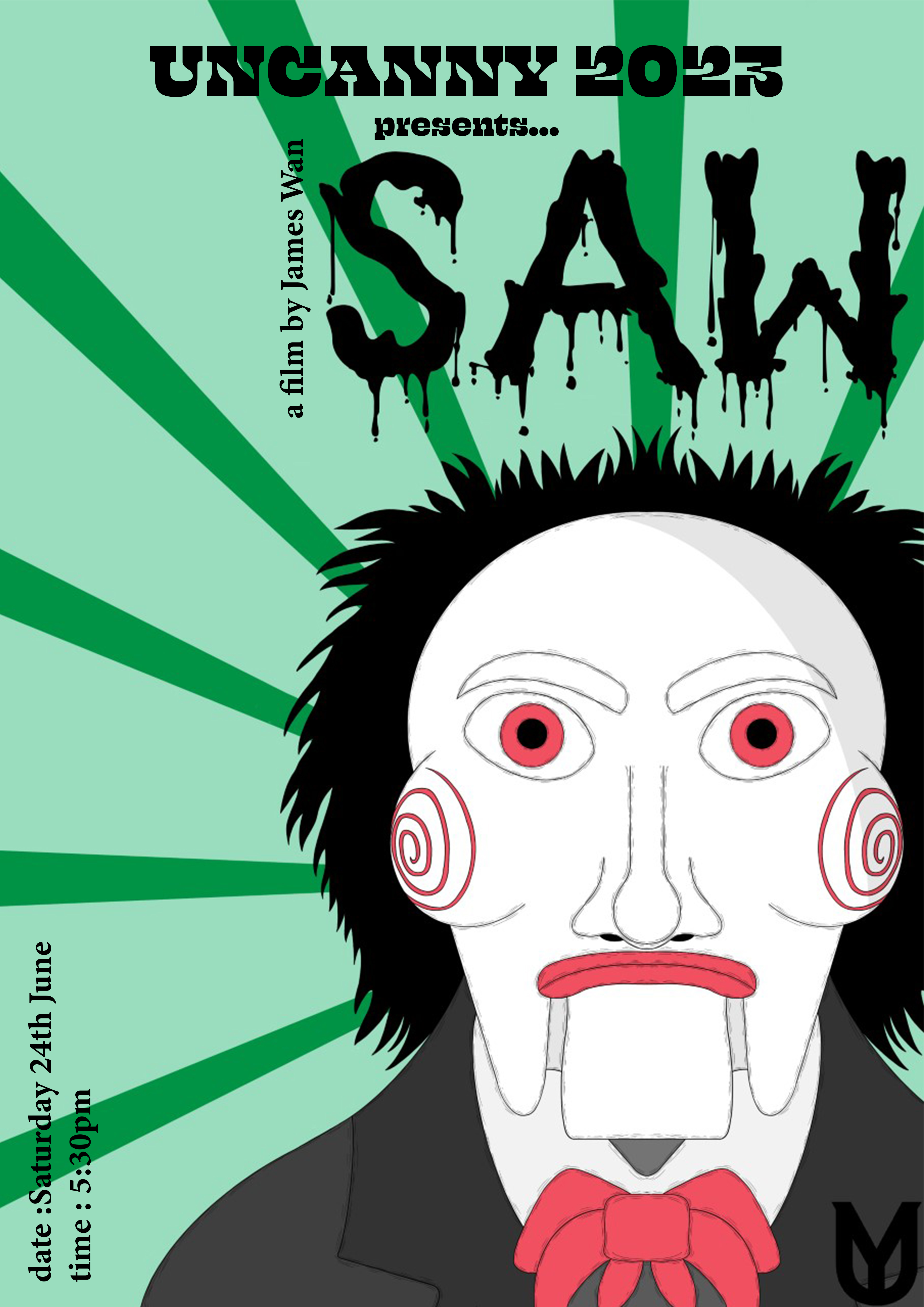


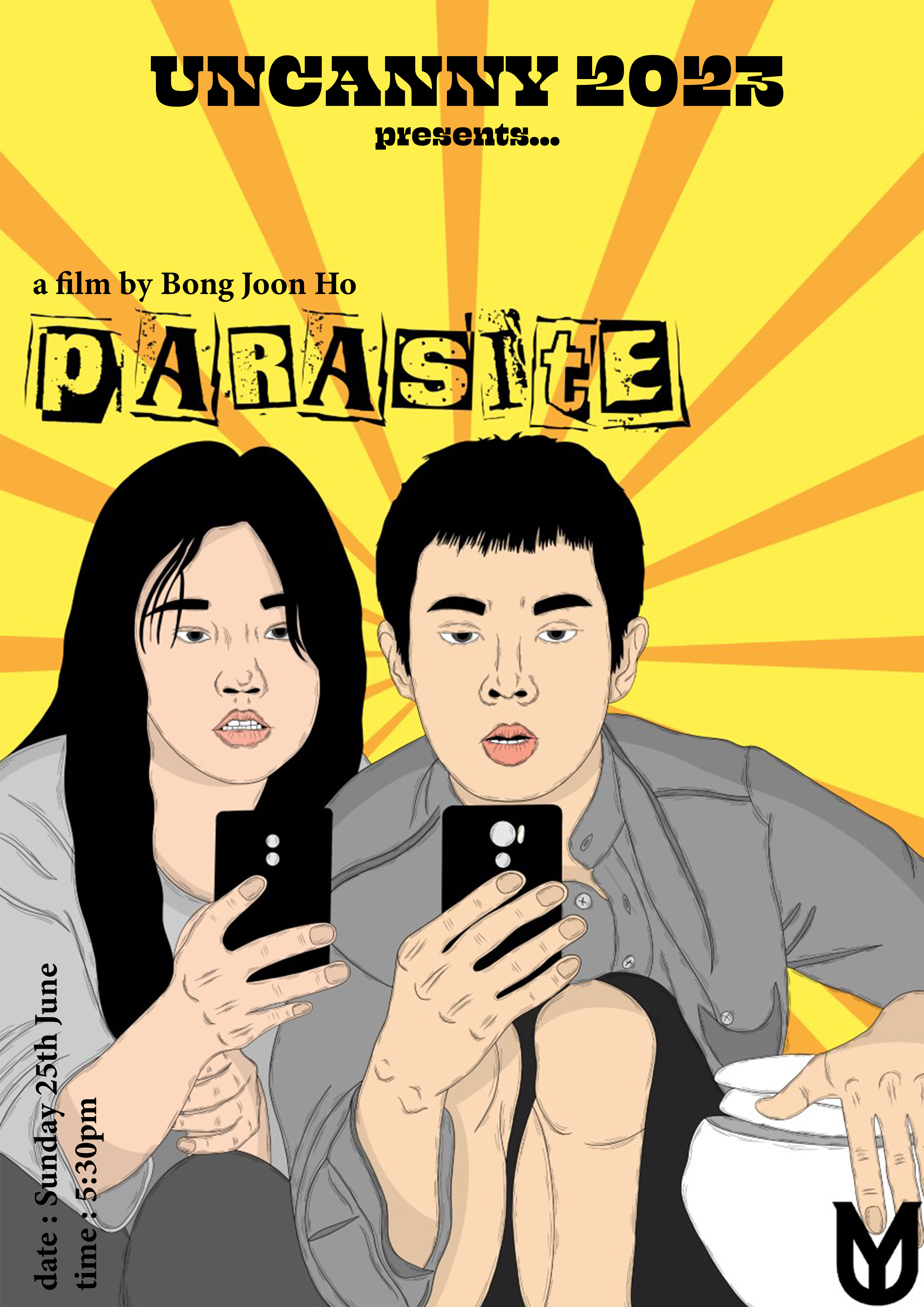


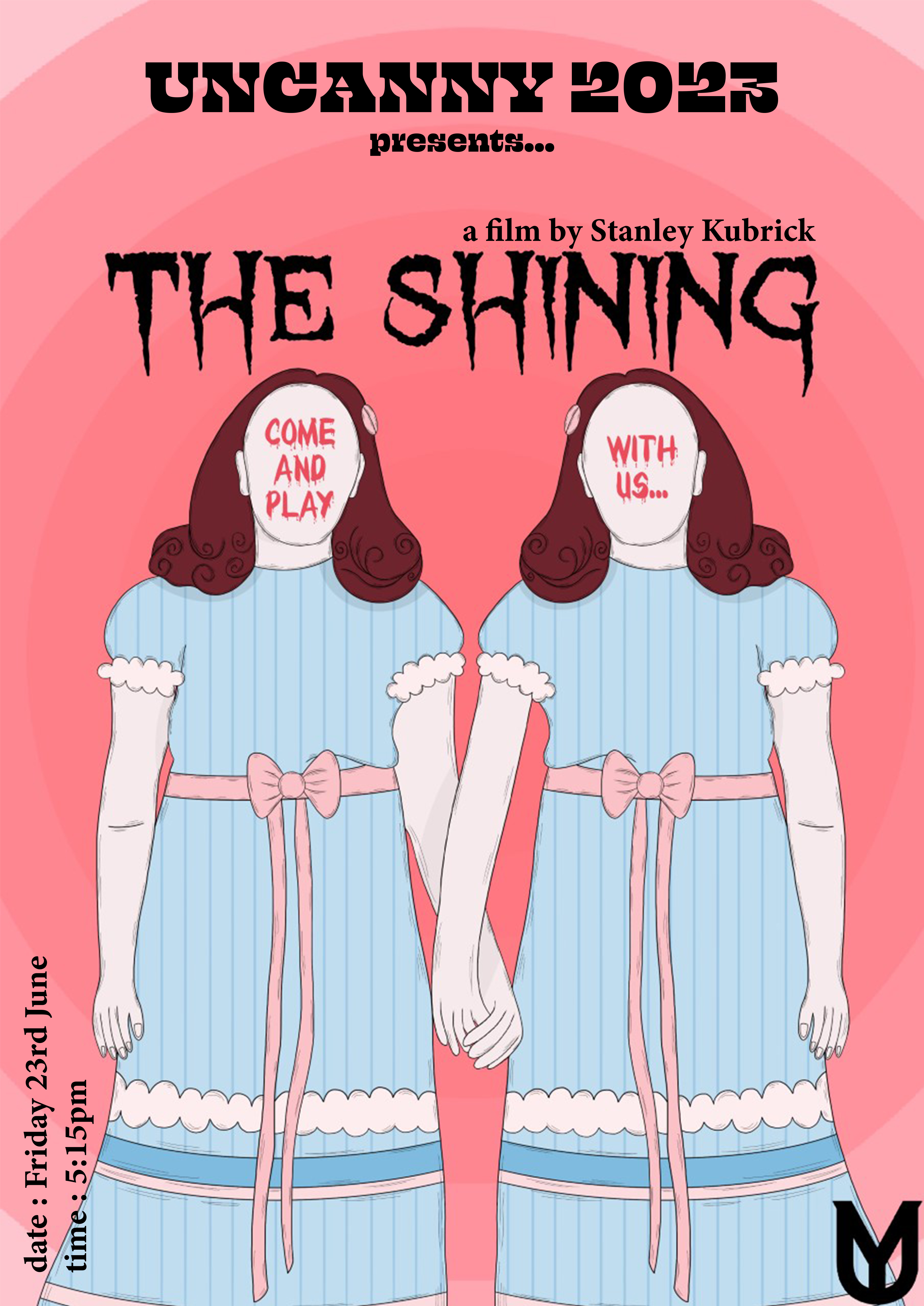
For my FMP project, I developed a horror movie festival which I then created all of the advertising and branding for - the main aspects of this project was creating 10 illustrated horror movie posters and a main advertising poster for the festival itself. For the horror movie illustrations, I used a detailed linework style to help add an eerie tone of voice, and I used colours available to me on the risograph printer at university (black, yellow, red, pink, green, blue). By layering the different colours togehter, I was able to create a wide range of shades, adding depth to the illustrations. For the main festival advertising poster, I took inspiration from current design trends and utilised a limited colour palette, as well as grainy textures, to create the abstract shapes for the poster - I then paired this with a contemporary typeface and the logo branding I created for the festival overall. I then also utilised this poster design for both the tickets and some of the merchandise ideas. I utilised a more graphic design approach for the editorial and social media adverts, using an image of the location for the festival, then adding both colour and texture overlays to add a more eerie tone of voice - elements of these were then used throughout the rest of the merchandise designs.
H!P Advert
For an editorial and advertising module in my second year of university study, I decided to create an illustrated advertisement for H!P Oat Milk Chocolate, advertising their original chocolate bar. I utilised soft pastel colours and hand-printed type to create an interesting and eye-catching outcome.

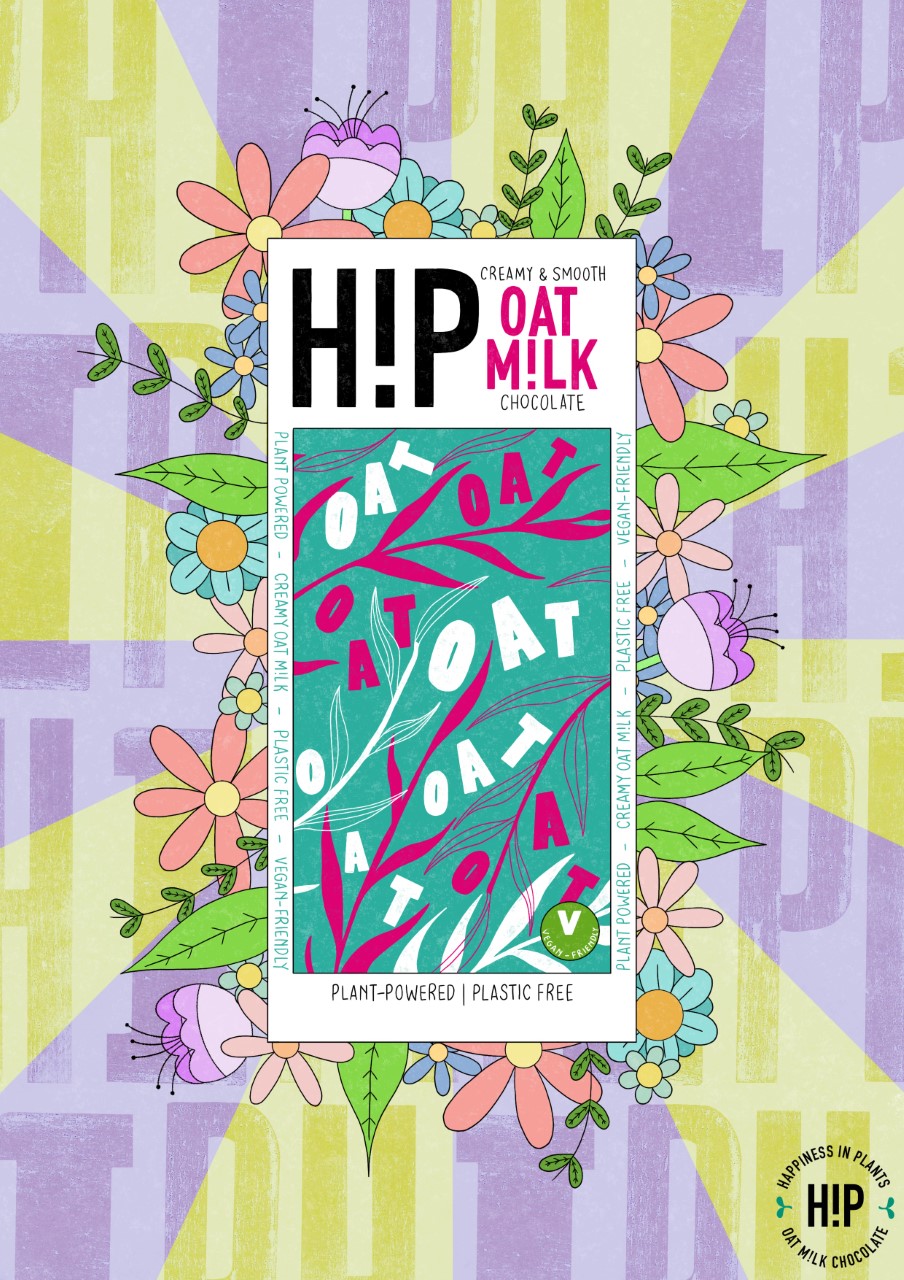

To create the main illustration, I used Procreate where I initially experimented with layout design and composition, finally deciding on having my illustration of the H!P packaging in the middle of the design, surrounded by simple flower and leaf illustrations, linking to the vegan and plant-based nature of the product. I added some pastel green and purple lines in the background to help emphasise the foreground - the the lettering in the background, I added some type that I had hand-printed on a letter press machine, blending it into the pastel colours to help it look more integrated, and finally finished the design by adding the company logo to the bottom right-hand corner. I also added these designs to two different mock-up examples (one magazine, one urban setting), to show how the design would work as a final finished outcome.
Final Destination 6
For another aspect of the editorial and advertising module, I created an advertising movie poster for the newer Final Destination 6 movie - I focused on a limited colour palette and detailed linework to capture an eerie tone of voice that reflects the tone of the movie itself.
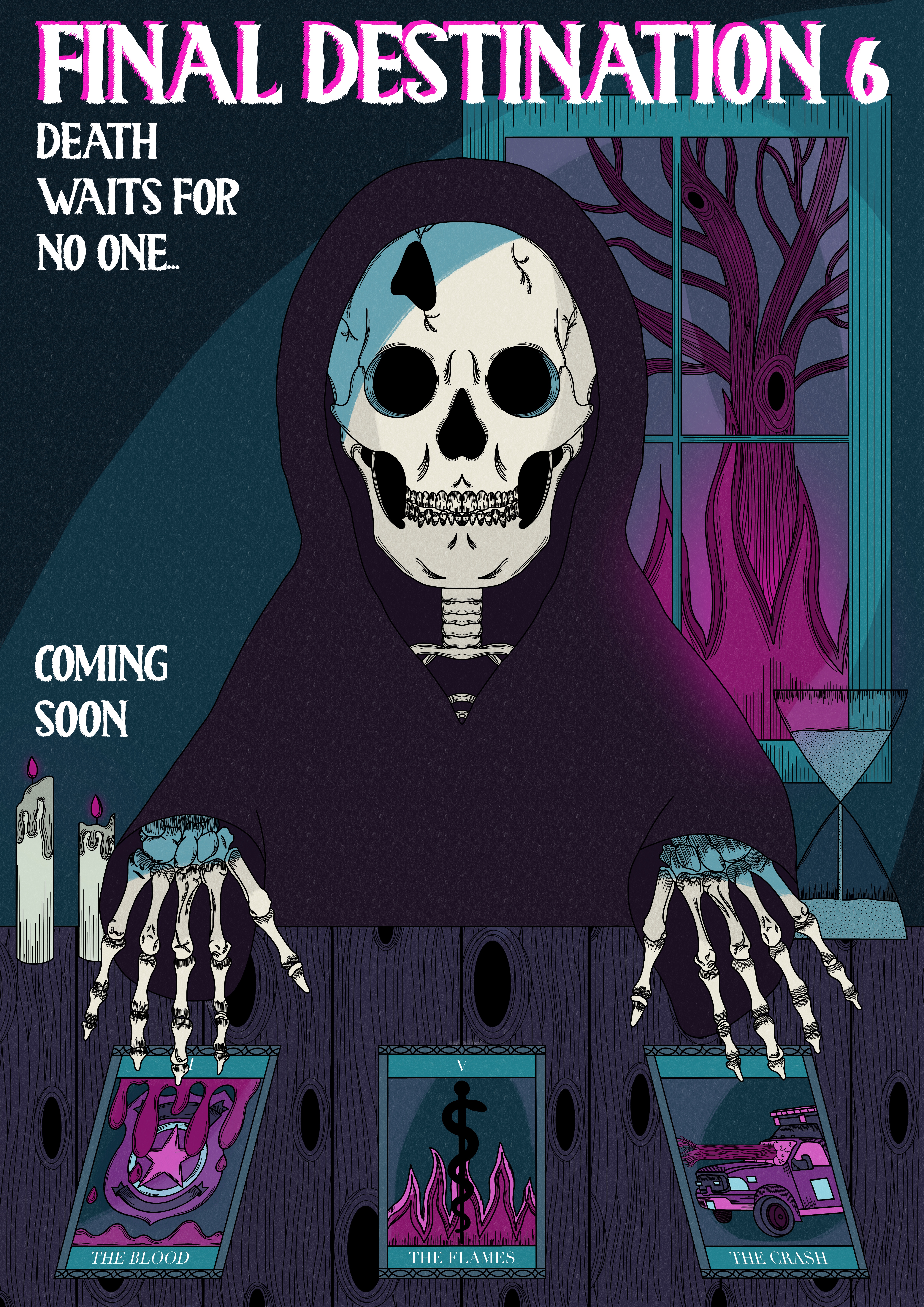
To create this movie poster, I initially focused on creating some really detailed linework, using varying brush thickness to help create depth to the piece, by using thinner brush strokes to create shading. I also added a lot of details throughout the illustration, such as the designs on the tarot cards and the flaming tree in the background. For the colour palette, I took inspiration from a range of non-representational colour option seen throughout other movie poster designs that I researched, and decided that a bright pink / purple worked well with the combination of blue tones I chose as well. I added a combination of brush tools to create an illuminate effect in the background in particular, helping to add furhter light and shade to the illustration overall. I finalised the illustration by adding typography of the title of the movie, and a tagline for the movie itself - since the release date of the movie hadn’t been released at the time of creating the illustration, I also added a ‘coming soon’ addition to the poster as well, which also helped to break up any negative space in the piece as a whole.
‘Magic of Food’ Exhibition
For one of the modules in my second year of university, I created a large scale screenprint of fruits and vegetables for an exhibition at a local food-waste friendly cafe - The Magic Hat Cafe.
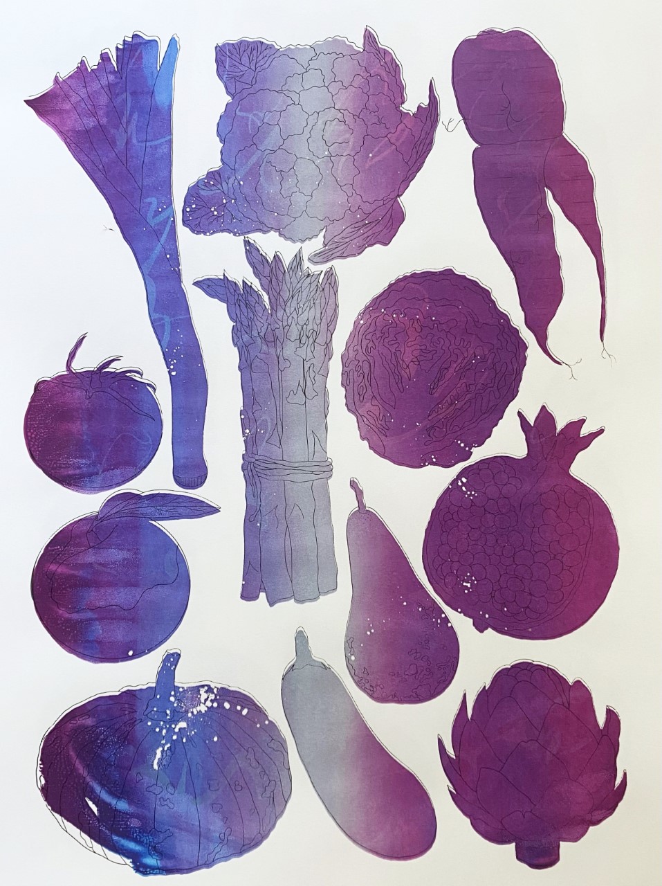
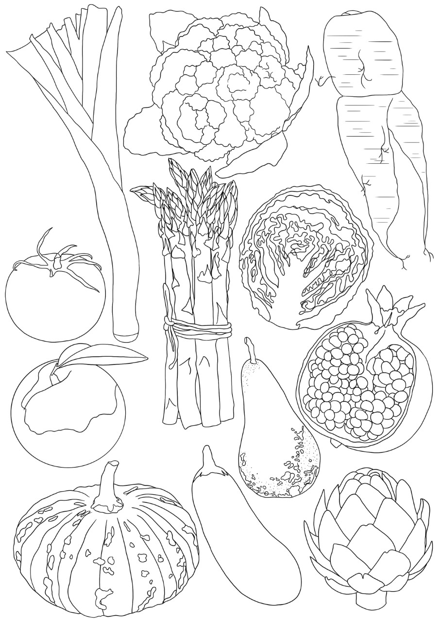
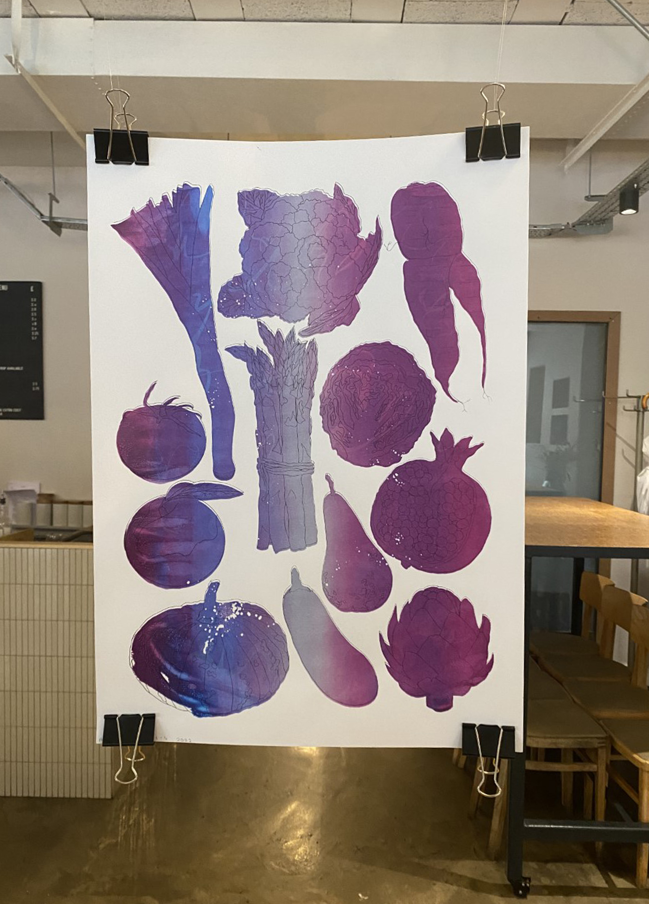
To begin creating the large-scale print for the exhibition, I went through a variety of different ideas before settling on creating a linework heavy design of fruit and vegetables - since the exhibition piece had to link to the theme ‘The Magic of Food’, I decided to focus on linking my work to this theme through the non-representational colour palette. Also, as it was a group exhibition, we decided to create our prints using eco-friendly print methods where possible. After developing a range of colour palette ideas digitally, I then went on to screenprint my A2 print using the print studio available at university. I also played around with making my own ink colours, and swirling the colours on the silk screen to create a magical / galaxy effect. I also added some talcum powder to the paper before printing each layer, which created a couple of areas where the ink didn’t print, creating an interesting texture to the final print. Once all of the groups’ work had been printed, we exhibited our work at the Magic Hat Cafe in Newcastle upon Tyne for a limited time.