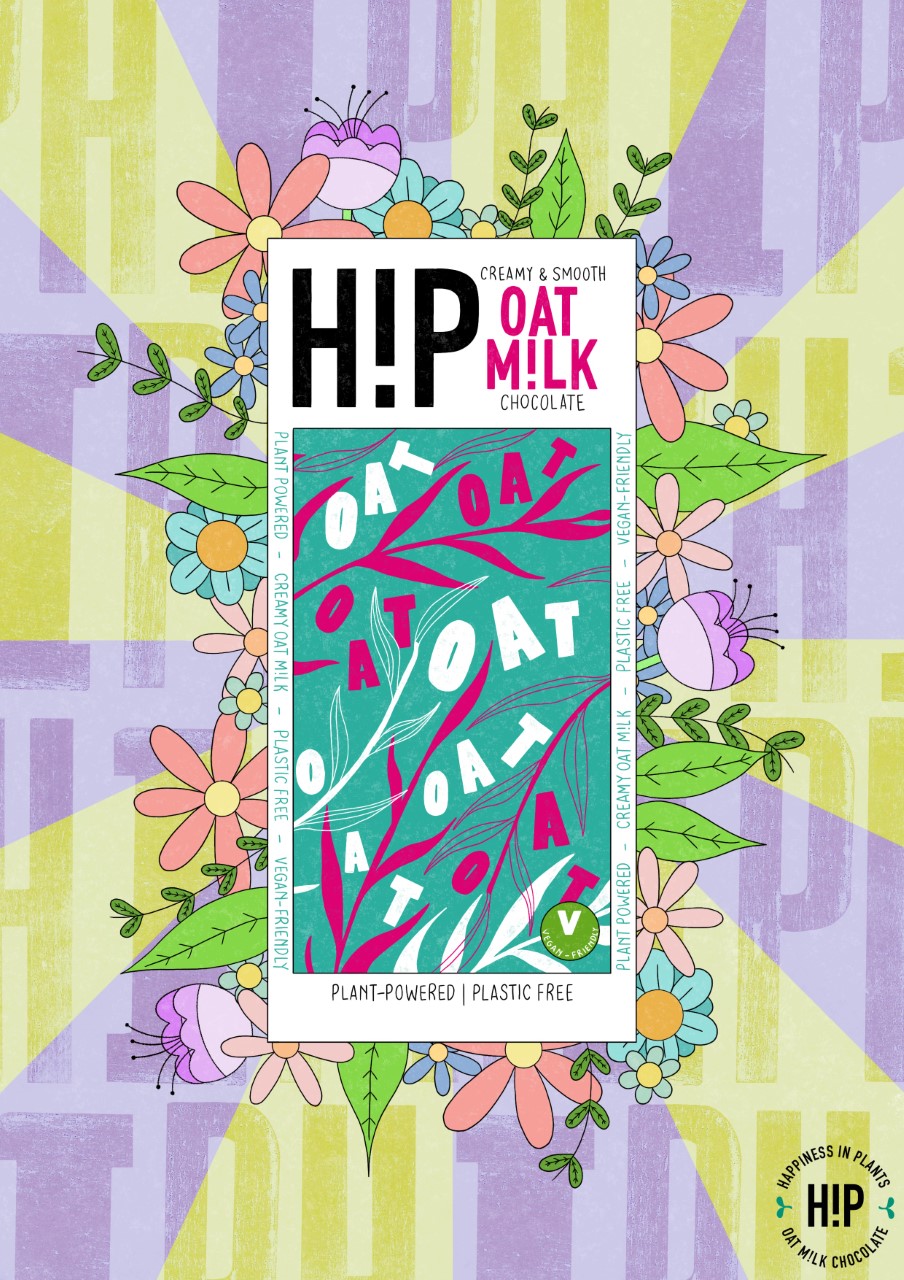
H!P Advert
For an editorial and advertising module in my second year of university study, I decided to create an illustrated advertisement for H!P Oat Milk Chocolate, advertising their original chocolate bar. I utilised soft pastel colours and hand-printed type to create an interesting and eye-catching outcome.


To create the main illustration, I used Procreate where I initially experimented with layout design and composition, finally deciding on having my illustration of the H!P packaging in the middle of the design, surrounded by simple flower and leaf illustrations, linking to the vegan and plant-based nature of the product. I added some pastel green and purple lines in the background to help emphasise the foreground - the the lettering in the background, I added some type that I had hand-printed on a letter press machine, blending it into the pastel colours to help it look more integrated, and finally finished the design by adding the company logo to the bottom right-hand corner. I also added these designs to two different mock-up examples (one magazine, one urban setting), to show how the design would work as a final finished outcome.