Beabadoobee
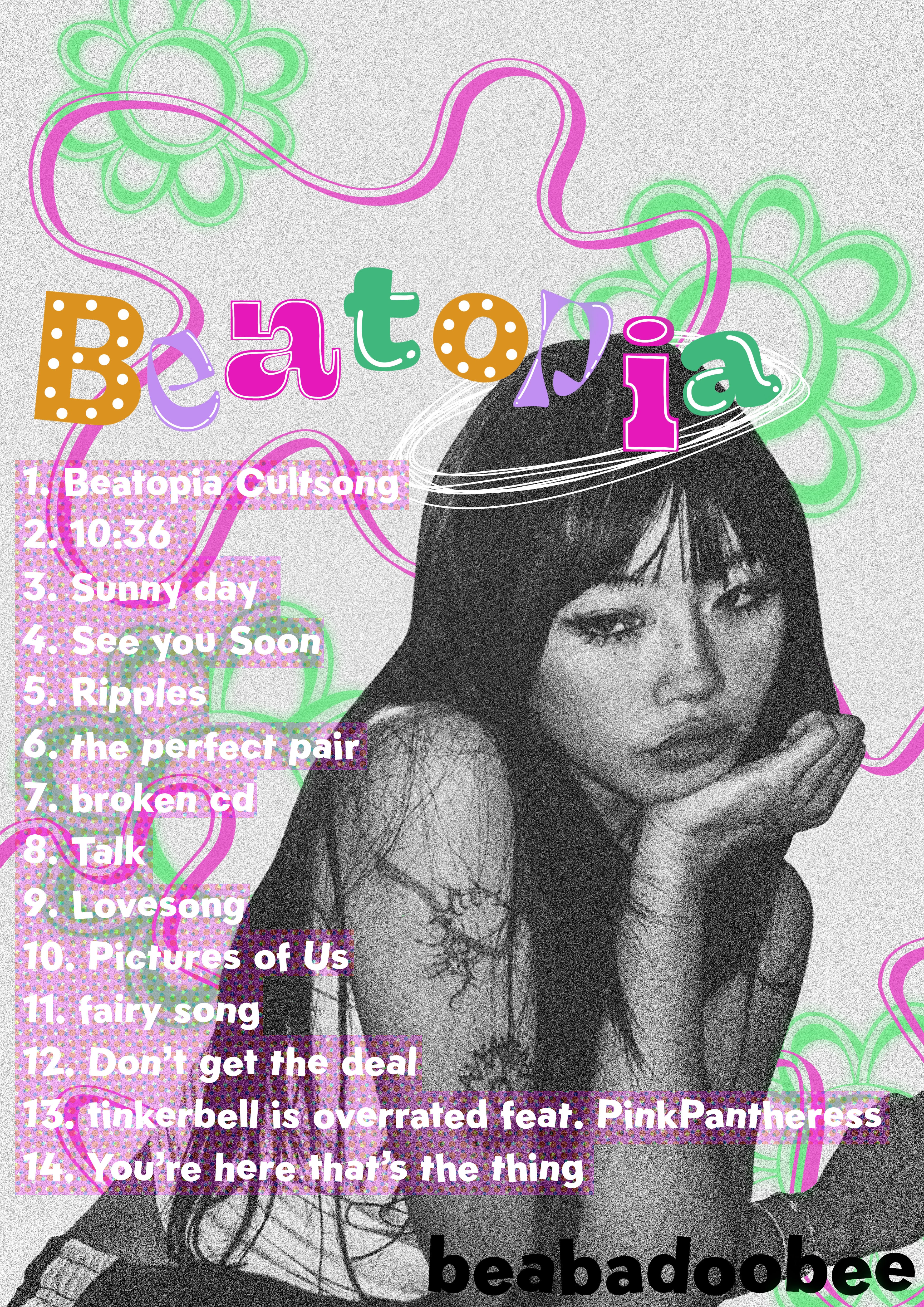
For this personal project, I created a graphic design piece in the style of an advertising poster for Beabadoobee’s recent album Beatopia. I combined both graphic design elements and more illustrative aspects to create an outcome that is in touch with current design trends.

One of my favourite personal projcts was creating this advertising concept for Beabadooee’s album ‘Beatopia’ - I combined my love of current graphic design trends and illustrative elements to create this poster design. I started the piece by removing the background on an image of Beabadoobee and then changed the saturation to black and white, and then added a noise filter and colour haltone filter to help add a grainy texture. I then added type on Photoshop, using a range of four different typefaces for the title of the album in alternating colours - then, on Procreate, I added the smaller illustrated elements, such as the details on the type and the shapes in the background. Finally, I added the titles of the songs from the album and added a pink background (such another colour halftone filter) to tie the textures across the piece together.